“Holy jumping Caesar’s catfish, my ‘H’ has been stolen! Ohhh, that’s how people know it’s a Honda! What’s the point of having a Honda if you can’t show it off?”
Honda’s H logo clearly mattered a great deal to Superintendent Chalmers in a popular 1996 episode of The Simpsons, though the audience might have wondered why Chalmers’ boast of “making superintendent money” still only allowed him to buy what was by that point a 17-year-old Accord.


The even more eagle-eyed might have spotted that the emblem wrenched off the front of the superintendent’s Accord was actually incorrect for the year of the car. The fade marks left by the missing badge depict a wider H, which arrived two years after the character’s 1979 model was built.
Since 1963, when it began producing automobiles in Japan, Honda’s car division has only had four significant emblems. That will change in 2026, when the first in a dramatic new line of Honda electric vehicles arrives wearing a new H logo, the badge’s first significant redesign since 2000. Look at each in turn, though, and despite their differences, Honda has clearly seen fit not to mess with one of the world’s most recognizable automotive marks.
Honda’s first H: 1961–69
There appears to be no official explanation for the design of the original Honda H. It’s said to have first appeared in 1961, a significant date in Honda’s history, coinciding with the firm’s first victory at the Isle of Man Tourist Trophy races and with the opening of a new R&D facility in Saitama, Japan, but at that point Honda was still denoted by its famous winged logo, a design that had already been through five evolutions since 1947.
The first automobile to use the familiar H, and indeed Honda’s first automobile full stop, was the T360, a tiny kei-class pickup truck unveiled at the Tokyo motor show in 1962. The H then appeared on the S500 sports car, but not until 1969 would customers in the vital US market become familiar with the badge, affixed to the front of a tiny two-door sedan dubbed the N600.
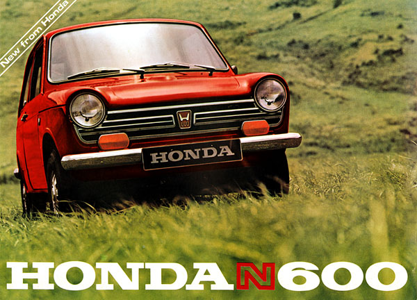
Based on Japan’s N360, another kei car, the N600 still had an engine displacement smaller than that of most motorcycles (the clue was in the name), but that parallel twin could buzz along at 80-or-so mph all day. The N600 sold alongside the sportier Z600 – same engine, kooky styling – before both were replaced by an all-new car wearing an all-new badge …
1969–81

Here’s the Honda logo that Superintendent Chalmers’ Accord should have been wearing. It debuted in 1969 on the little-known Honda 1300, an air-cooled vanity project of Soichiro Honda that leaned too heavily on his focus on engineering above all else and, as result, sold poorly in its home market. Its replacement was ushered in swiftly for 1972 and, with the possible exception of the Super Cub motorcycle, did more to build Honda’s brand than any other vehicle in its history.
That car was the Civic. Next to the 1300 it was middle-of-the-road conventional, but against the N600 it replaced, it was significantly more useful, with double the cylinder count and notably more torque. Just a year after the car’s debut, the oil crisis hit. Combined with growing unease over pollution, the frugal Civic – with its low-emission CVCC (Compound Vortex Controlled Combustion) engine, which needed no power-strangling catalytic converter or weedy carburettor to meet new emissions requirements – arrived at the perfect time.
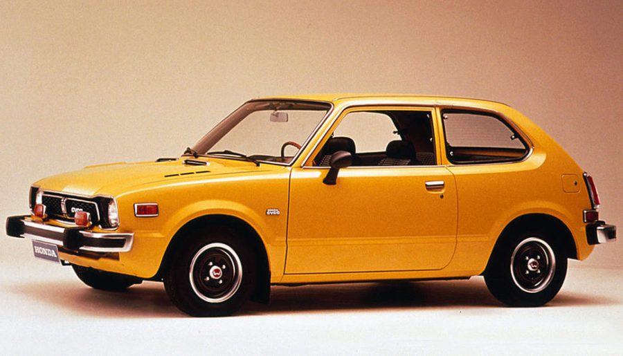
Against all this the Honda H of 1969 is less exciting, but it notably lost the HONDA wordmark and went from a low and wide design to a tall and slim one – typically a white H on a black background. On Chalmers’ Accord, the real badge would have sat neatly on a slim chrome trim piece at the leading edge of the hood.
1981–2000

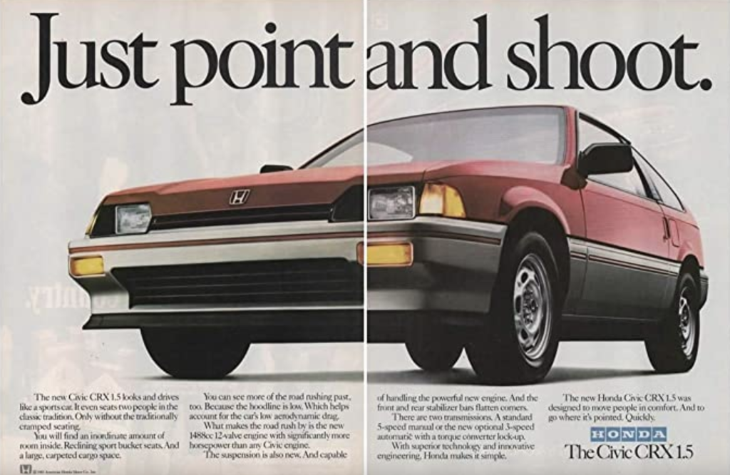
The next change came in 1981, and it’s this logo that forms the basis of the emblems applied to the front of every Honda since. The key elements were all in place by this point: An H that splits the difference in height and depth between the designs of 1961 and 1969, always presented within a soft-cornered trapezoid, and with the bold uppercase serif lettering making a return – although typically used on a separate badge, rather than below the main logo.
The new badge debuted on the City supermini in Japan but soon featured on much more exciting cars, such as the Honda CRX. By now on its third-generation Civic, Honda supposed that customers might also like a sportier variant, and the CRX of 1983 was the bob-tailed, flyweight (right around 770 kg) result. Spectacularly economical in its earliest iteration, the CRX is even better appreciated in its 1988 second generation, with a distinctive split-glass rear hatch and, in some markets, a dual-overhead cam VTEC engine making nearly 160 bhp from 1.6 litres.
The badge itself had subtle evolutions throughout the next two decades, but was mostly seen as a raised chrome emblem with no solid color background. The exception is on Honda’s Type-R models, a moniker that debuted with the NSX in 1992 and brought back the red background seen first on the nose of the S500 in the 1960s.
2000–present

In 2000, the Honda H became a skeuomorphic design, with a 3D appearance replicating the actual chrome logos seen on most Honda cars by that point. The Honda script itself was now bright red, a detail you’ll see in most of the brand’s official literature, though white and black are also used for contrast depending on where the script is being used; Honda often ditches the H entirely in brochures and on some of its websites. The use of the logo on cars still varied, with a chrome logo standing proud of the grille on some, and a flush-fitting H with a solid background on others.

It arrived on 2000’s Civic, but no other model better heralded Honda’s new-millennium look than the S2000. Launched in 1999, the S2000 was the most focused model from Honda since the NSX a decade earlier, and indeed it was built in the same factory. Like all the greatest Hondas, the S2000’s centrepiece was its engine: a two-litre four with a 9000-rpm fuel cutoff making 234 bhp through one of the tightest shifters you’ll find.
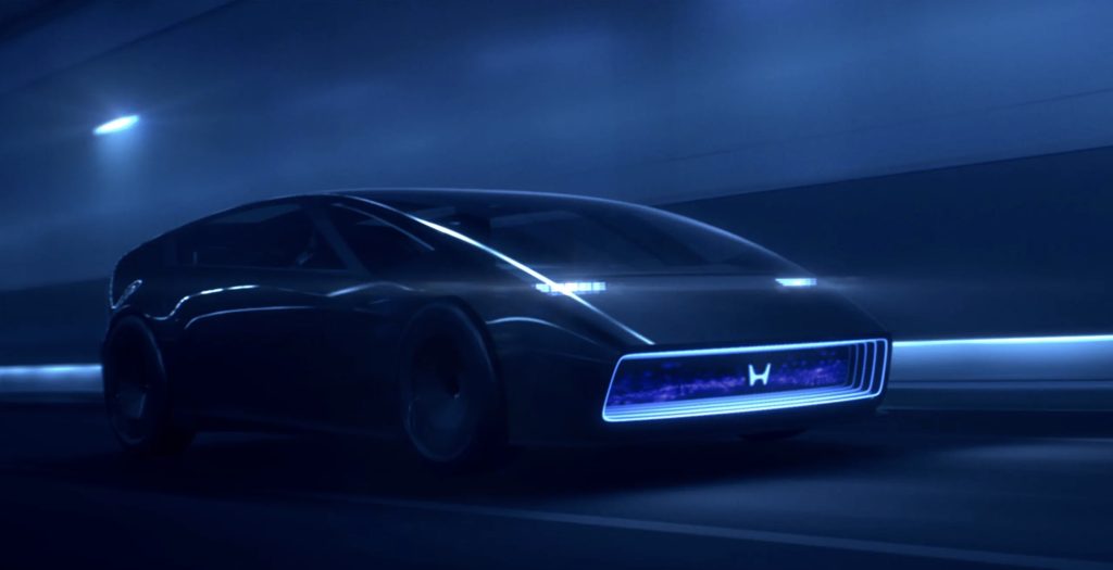
2026–forward
Honda’s next generation of production cars doesn’t yet have a solid launch date, but the 0 Series concept shown at the Consumer Electronics Show in Las Vegas will supposedly debut in relatively unchanged fashion in 2026.
However much the low-slung sedan morphs before then, an aspect that probably won’t change is one of the more significant updates to the H logo in the company’s history. Wider and shorter than the outgoing badge, it’s closer in spirit to the 1961 original than any we’ve seen since, and just like the original logo, it has no defined background.
Honda isn’t the first car brand to return to a historic logo: Citroën and Peugeot have recently both gone back to designs inspired by their early days, Renault’s latest design harks back to the 1970s, and many more such as VW, BMW, Skoda, Audi, and Mercedes-Benz have, like Honda, adopted a flat logo in recent years.
Just as with these, Honda’s new look reflects advances in design and technology, perhaps alluded to with badges increasingly becoming illuminated. But perhaps it’s also a nod to the fact that unlike some of the auto industry’s recent startups and upstarts, having history and heritage – and a recognisable brand mark—is something to be proud of.
Superintendent Chalmers understands that Honda pride, even if the details got lost in his animation.