
The room is bright, and warm. Within it, signwriter Terry Smith stands at an easel, his chest rising, pausing, and falling; each brush stroke is a breath held. He appears entranced; locked into an irregular but comfortable rhythm with his paintbrush, his companion. Its once crimson-lacquered handle has been worn down to bare wood, they’ve been acquaintances for years. A prickly whiff of paint thinner hangs in the air.
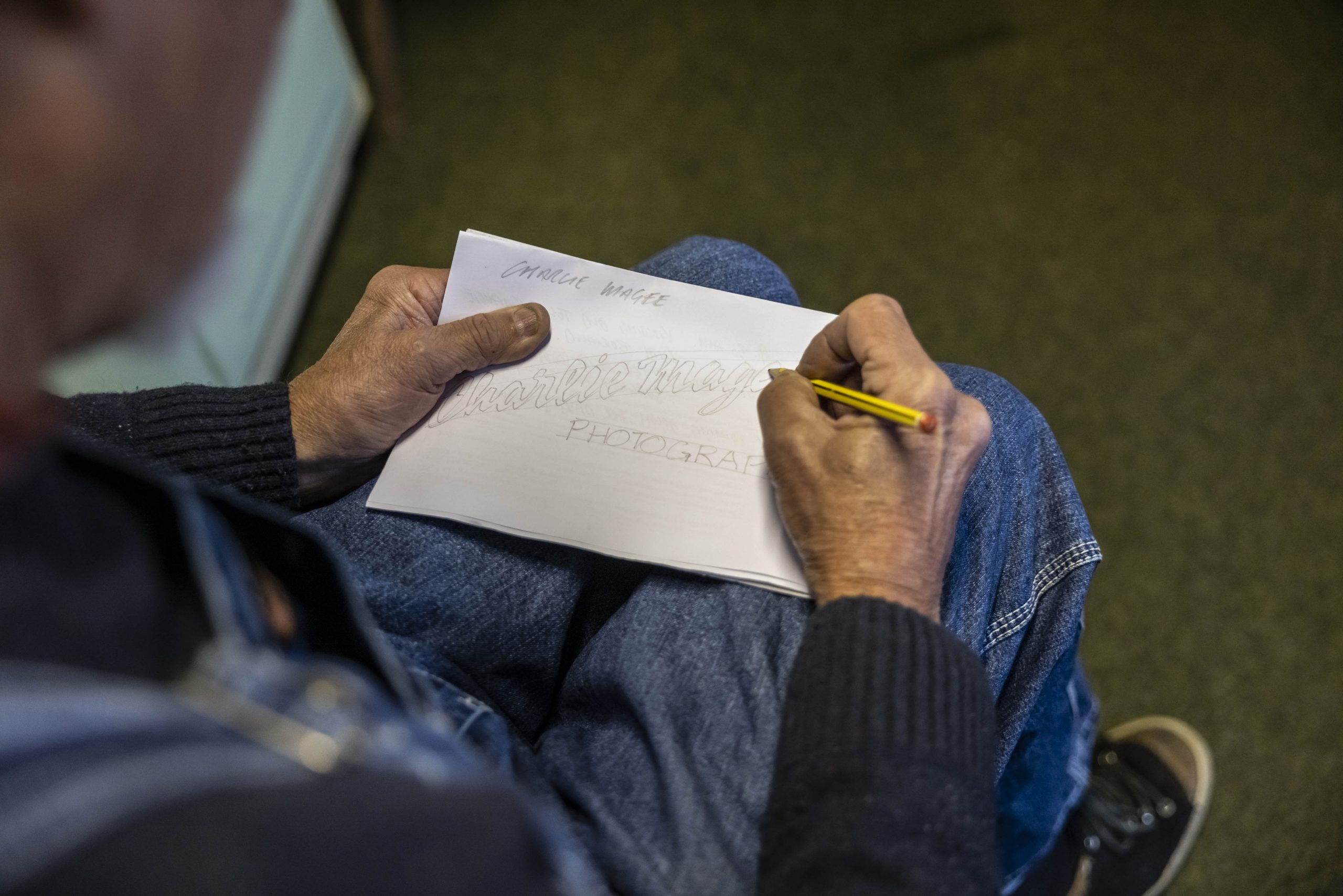
Working from left to right, Smith supports his painting hand using a mahl stick. Referring to it as his third arm, its round, padded head glides across the surface of his work, collecting chalk dust from the positional renderings he uses as a spacing guide. In signwriting circles it’s known as the pounce method, but Smith doesn’t rely on it.

With the brim of his flat cap resting on the frame of his glasses, his eyes are cast in shadow, but I can see them darting, repeatedly, to his right. “I’m projecting the finished letter in my mind’s eye,” explains Smith, who has been signwriting, the traditional way, since the mid-seventies.
“I won’t follow the chalk marks, they show me where I need to start and finish, but it’s up to me and my brush to get it right. If you can’t freehand when painting lettering you won’t earn a living out of it; it’s a sixth sense that’s difficult to teach.” The signwriter’s “sixth sense” is something Smith refers to a lot.
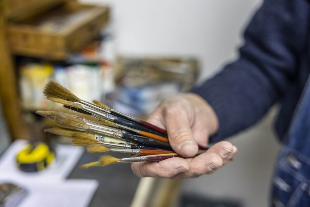
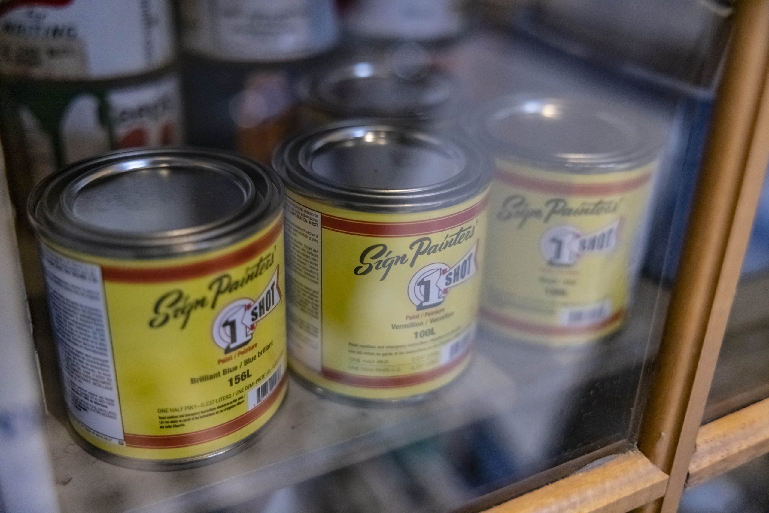
Using the inside edge of a paint pot as his palette, Smith manipulates the bristles of his brush with a series of strokes to find its “sweet spot”. All brushes, he says, have a point at which they perform their best because of the way their bristles have been laid and fastened. “When you use them day in, day out, you get to know what they’re capable of.”
From tip to tip, an artists’ paintbrush comprises three main parts; the head, the ferrule and the handle. Their specific anatomy, such as size and brush shape makes them “characters in their own right”. Once you know how to get that optimum chisel, Smith says, it’ll give you what you want. “By making friends with them you can get the best result from them, but if a brush starts to shed its bristles, it’s had its day.”
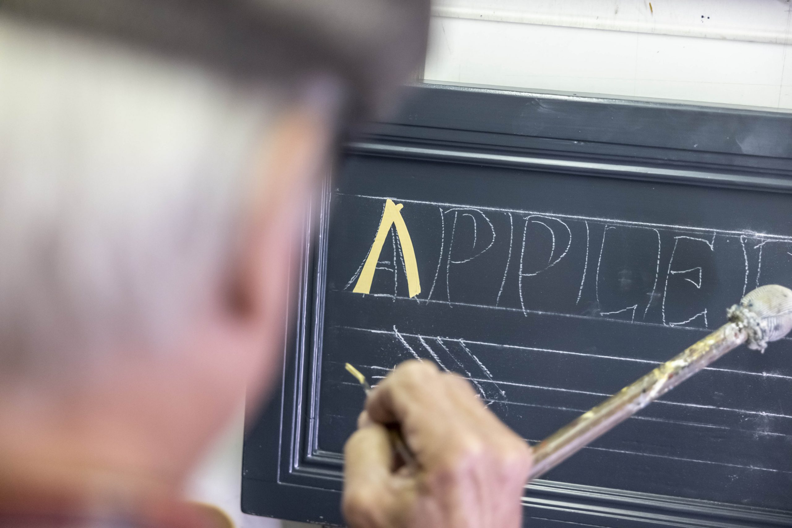
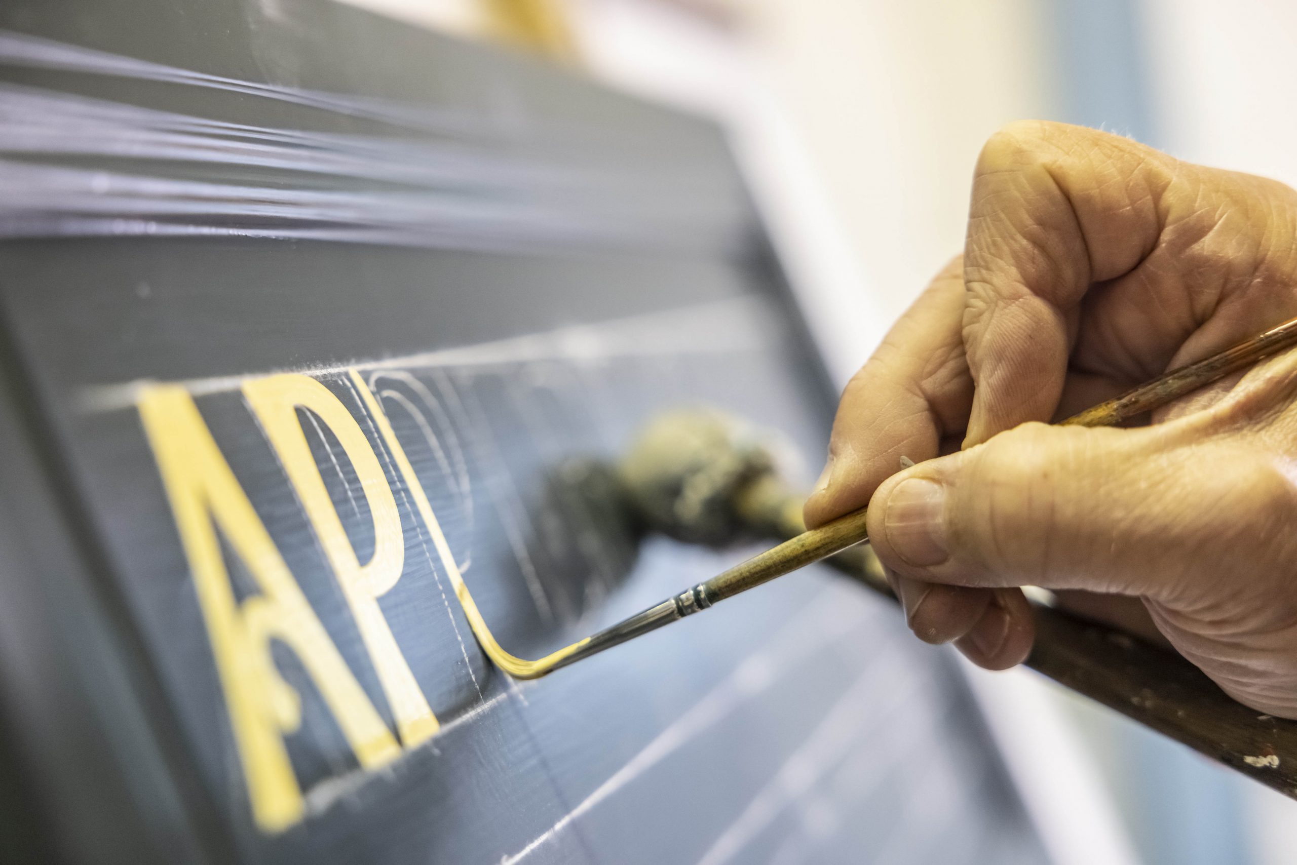
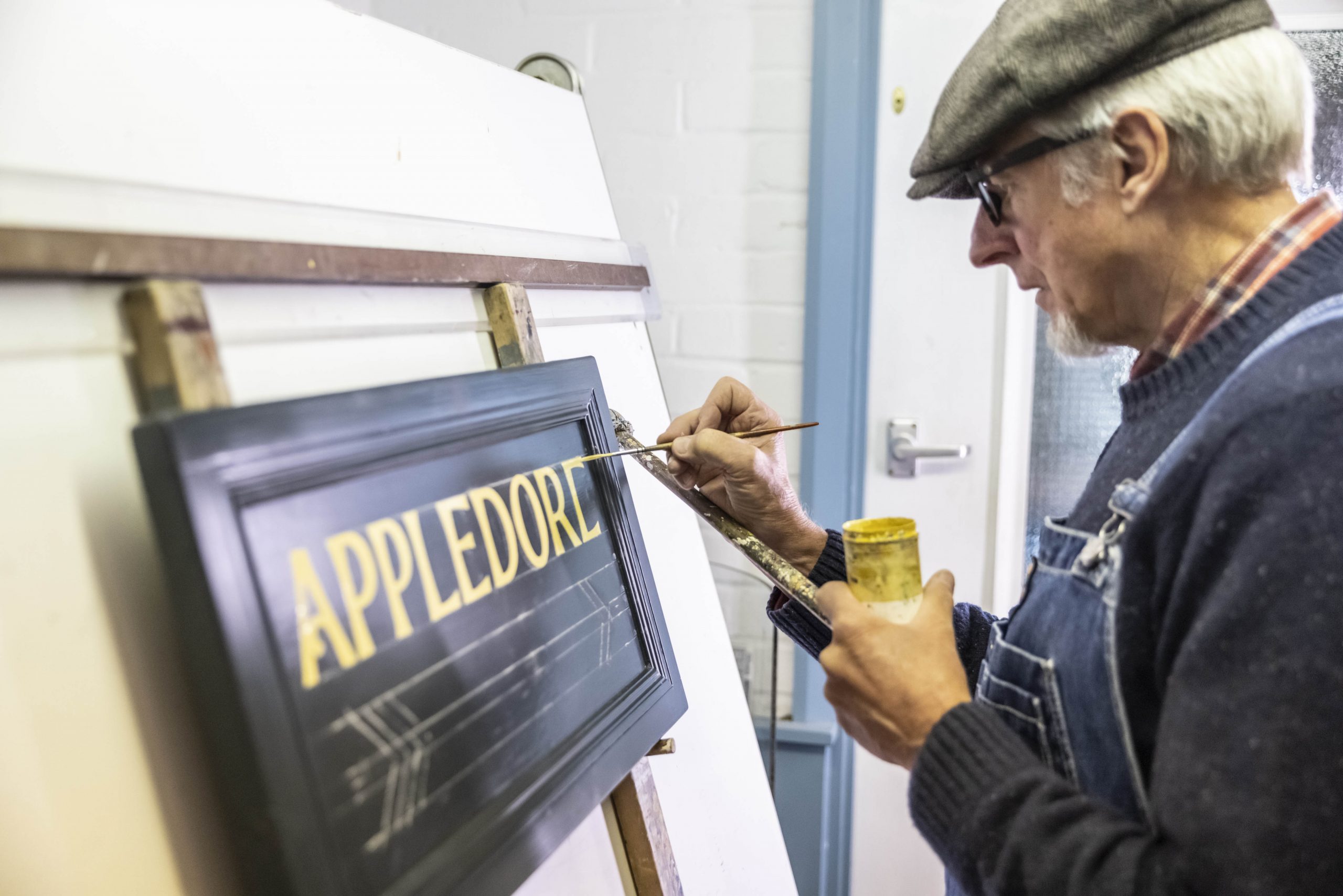
Gradually, letters emerge from a mesmerising sequence of swirls and curls and quick-fast flicks, and with a lift and a twist Smith adds a flourish to the foot of the final letter. Whether vertical or horizontal, I observe, he paints straight lines impeccably, but there is, he tells me, a tremble in his hand. Undetectable to the naked eye, it’s a deliberate and exacting technique that helps persuade paint to part ways with a brush; think of it as an artists’ vibrato, if you will.
Had life panned out a little differently, we might not have been on our own in Smith’s studio. Of his two sons, it’s the one who emigrated to Australia that inherited his creative flair. The final project they worked on together was a mural of the Brighton Belle electric train; it remains Smith’s largest single work to date. Spanning over 50ft, it occupies three panels set into the arches of Brighton station’s forecourt, and took five weeks for them to complete. “I miss bouncing ideas off each other,” says Smith, as he sets down his paintbrush. A signal that it’s time to take a break.

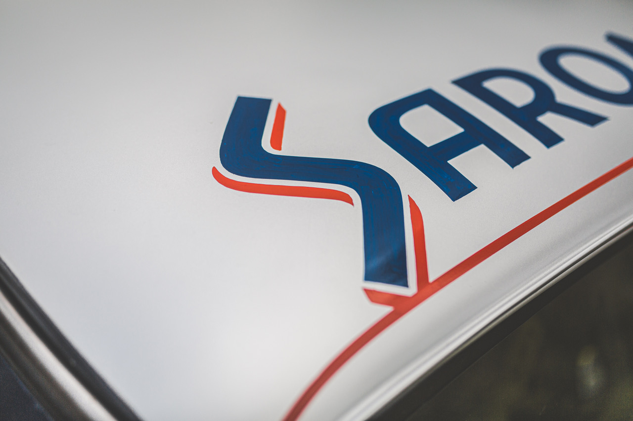
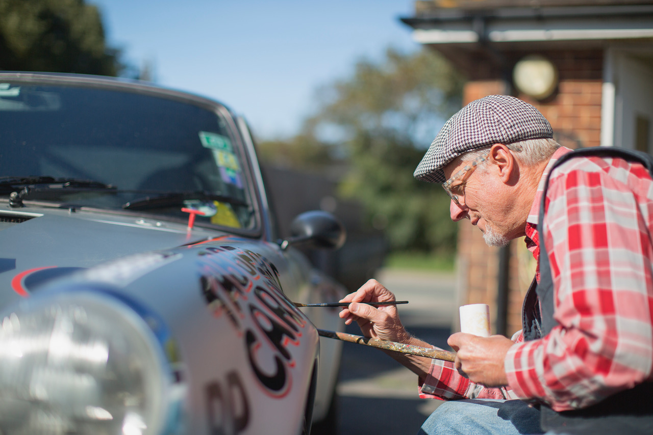
Over black coffee and chocolate biscuits, Smith shows me photographs of his signwriting accomplishments. I recognise scenes from Goodwood’s Revival, “I paint the ‘Gentlemen, start your engines’ kind of stuff,” he says, before distracting me with pictures of the restored 911 that was used as a promo car for Private Motor Club magazine. It’s a commission that he’s particularly fond of: “the livery was inspired by a Porsche that raced Le Mans in 1972,” he explains. “When signwriting a car, you have to ignore its curves because you want the artwork to be true to its original design and form; you don’t want to elongate anything whether that be lettering, a logo or an image.”
With steam rising from his cup, Smith recalls a “bitterly cold” assignment that took place in a dusty Dutch barn, and confides that on occasion, his paintbrushes have played second fiddle to his portable convection heater. Cold hands, he emphasises, are not conducive to effective signwriting.
As he guides me through this deconstructed portfolio of work, Smith reveals why he refuses to tweet, gram or Snap in order to attract new business: “My reputation and word of mouth seems to do the trick and I’ve won more jobs doodling on the back of an envelope than any other way. Over the years I’ve walked into shops, picked the pencil out from behind my ear, roughed something up and bingo, I’ve got the job.” Without a website or an email address to his name, if you want to make enquiries you’ll have to contact Terry Smith Signwriting the old fashioned way; by picking up the phone.
At lunch time, we break bread overlooking fields that fall away into the sea within four miles. Home, for the moment, is a bolt-hole in West Sussex, but fundamentally, it’s wherever Terry parks his VW campervan. Bearing the same signwritten name as his automobilia shop, “Old’s Cool”, it’s the place where he reacquaints with his nomadic self. In 40 years, he has relocated 13 times, but his current casa – a converted police traffic control office with a trio of outbuildings that once housed panda cars and are now in service as a signwriting workspace, garage and store front – is ideal.
It was several studios ago – back in the eighties – that a salesman first came knocking at his door with a vinyl cutter. “I said, I’ve got a project for us to do,” recalls Smith, whose tone conveys a slight hint of mischief. The mano a mano that followed, he tells me, was a civilised competition between craftsmanship and computer.
“After he’d set his machine up, we started at the same time and we finished at the same time. I then said, ‘well there you go bud, that machine is £10,000 and I’ve got to buy countless rolls of vinyl to feed it. I mix my colours by eye, in a thimble, for what I need to do the job.’” The salesman countered Smith’s appraisal with the argument that vinyl is more efficient because it doesn’t involve drying time. It didn’t convince him.
“I instantly decided I wasn’t going to subscribe to it. I wanted to keep going, hoping that there would be a nice little niche for me to inhabit.” He continues with a word of caution: “If you’re even thinking about vinyl, I’m not your man. This is a different thing, this is hand done. I also don’t price it per letter, this is not like putting an ad in the newspaper.”
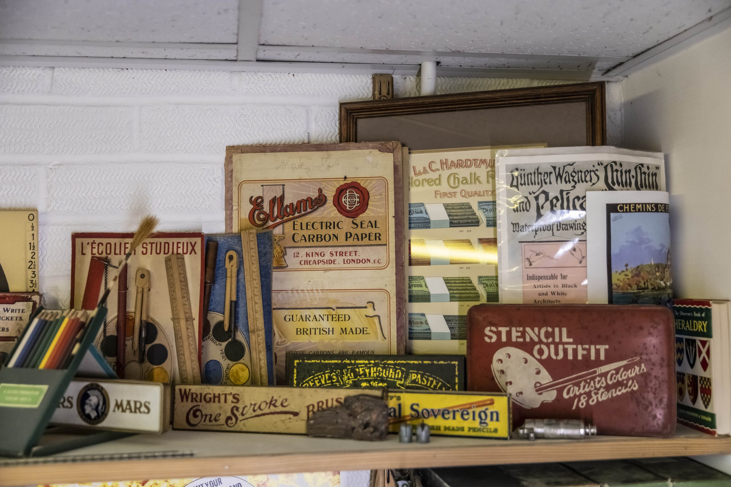
For centuries, buildings, boats and all forms of transport have been distinguished by hand-painted signs. Once upon a time, Smith says, “you’d see a signwriter in a high street, they were as common as decorators or plumbers.” A stickler for period correctness, he adds: “If an object pre-dates vinyl, then it absolutely shouldn’t wear it. I was asked to repaint the numbers on some of the former RAF buildings at Bicester Heritage which was nice, and if it’s a vehicle I’m signwriting I match its vintage to a typeface from that era. The vinyl boys often get it wrong, plumping for something they see on a screen that wasn’t even designed when the object they are working on was built.”
Smith laments the days when a recognised qualification in signwriting could be obtained at the City & Guilds of London Institute: “now it’s just left to nutters like me to drum it into people.” Back then, he says, a true signwriter could distinguish subtle differences in the handling of lettering that made it identifiable as an individual’s work. “The process of vinyl printing is genius, but to call it signwriting is a travesty. That’s why I call myself a sign painter these days.”
Nurturing newcomers to his craft, Smith runs courses and hosts workshops at the Brighton Fishing Museum, West Dean College of Arts and Conservation, and at home. Through this, he hopes to discover someone who has got what it takes to inherit his paintbrushes, but sign up, and be prepared to switch off: “I wouldn’t dream of having a mobile phone in my studio, the last thing I want when I’m in the zone is interruption.” Previous experience using small, fine paintbrushes, he says, is desired, and left-handed artists need only apply: “one of the tidiest workers I’ve ever seen was left-handed, she was fantastic.”
We carry our empty plates through to the kitchen. Smith will get to the washing up later, because his prevailing thought right now is to enlighten me to the basic principles of signwriting. Typeface, I learn, is the design of lettering, while font refers to how a typeface is displayed, such as size, weight (e.g. bold), slope (e.g. italic), width (e.g. condensed). I admit, shamefully, that I’ve been using the word font incorrectly, but Smith doesn’t judge. Instead, he recommends I watch the film Sign Painters by Faythe Levine and Sam Macon as homework.
Keen to move on, he lifts a practice board off the floor. On it, the alphabet has been painted in Gill Sans, one of Smith’s preferred typefaces. It was designed by the English artist and type designer Eric Gill, and he based it on Edward Johnston’s 1916 “Underground Alphabet”, which is used on London Underground signage. Its clean and rounded proportions, without extending features known as serifs, make it ideal for beginners.
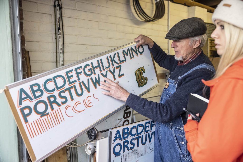
“Any signwriter worth his salt has a repertoire of typefaces in his head that can be done without needing to reference anything, but by anyone’s standards, Gill Sans is straightforward to copy because it requires a minimal amount of brush strokes. With those perfectly round o’s, it screams 1930s, it’s such a lovely type.”
There’s a temptation to rush things, I’m keen to graduate to other typefaces and experiment with dropped shadow – of which there are several variations – and gold leaf, but Smith is adept at defusing impatience. “We’ll get on to that in a minute” he says, knowing full well that without proper practice of the basics, it’s going to be an uphill struggle. Slowing down and an intuition for how fonts and effects can be applied to different typefaces is all part of the signwriter’s sixth sense: “You have to know how to play with them.”
I’ve assigned myself the task of painting a slogan on a chest that belonged to my grandfather. It’s going to be a surprise for my dad and Smith admires my spirit for “jumping in at the deep end”, but under normal circumstances wouldn’t recommend committing to a job as sentimental as this at such an early stage.
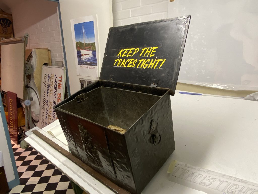
We settle on a speedy to accomplish “one stroke” style named Flash before transferring the words using the pounce method. As I grapple with multi-tasking a mahl stick, paintbrush and pot, Smith confides that there are times when he too can struggle. “My one achilles heel is getting A’s, V’s, and anything with a diagonal line that needs to be symmetrical not to look like a tent that’s falling over. It’s easier when they’re italic.” His favourite letter? An S: “I love the free falling sweep of its shape.”
My occasional mistakes could be wiped away with a dab of white spirit, but Smith reassures me that those imperfections will add personality to my first signwritten piece. He’s impressed, I think, by what I achieve. Typically it takes four hours for the enamel paint that I’ve used to dry, but our time together has come to an end.
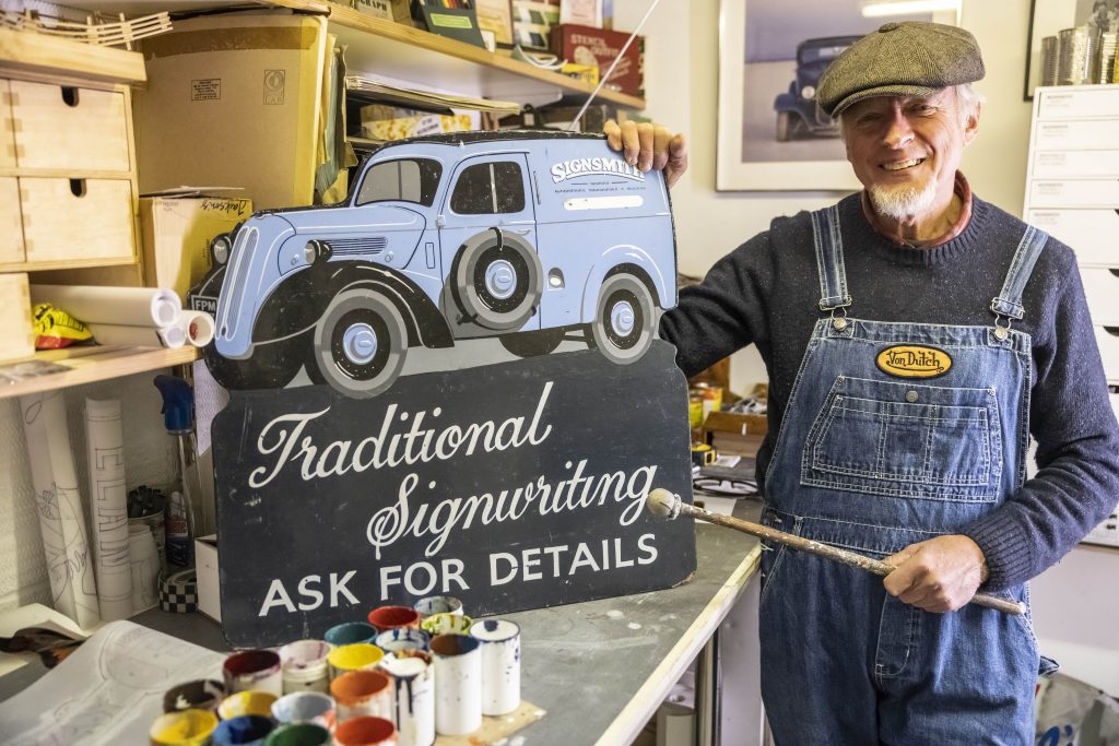
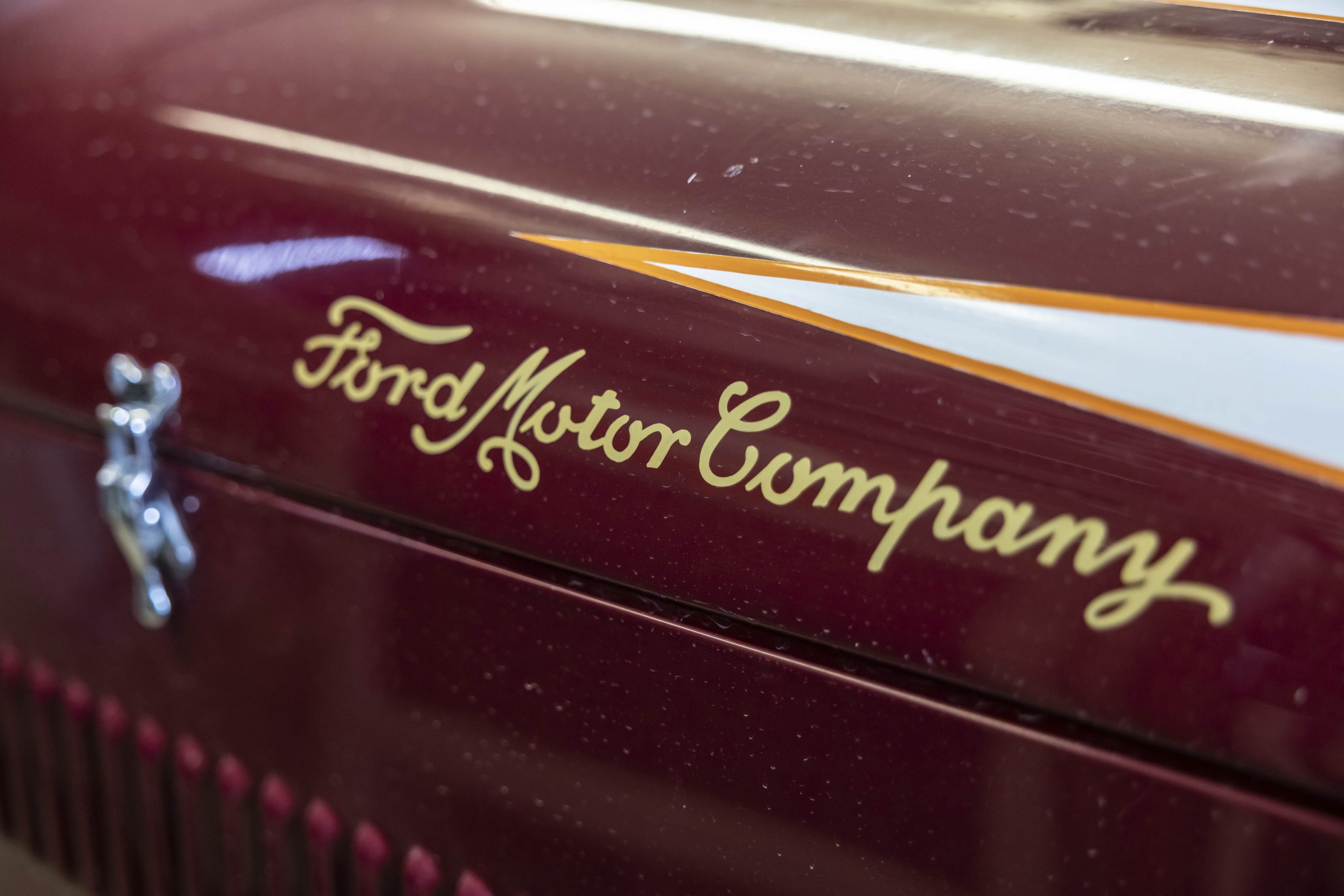
Before saying goodbye, we pause next to a Fordson van. It’s just a few shades of blue darker than Smith’s denim dungarees and the word “signsmith” is emblazoned on its side; when it’s not parked in the courtyard that separates his live and work spaces, it earns its keep as a mobile billboard. “It’s my trademark,” explains Smith, who seems a little melancholy. He continues: “me and Ford, we’re inextricably linked, my mum and dad were employed by them, it’s how they met.”
As I drive home, and away from the mist that’s rolling in from the sea, I think of Smith washing away evidence of the meal we shared together in a sink full of suds. His studio now dark, and turning cold, I hope that soon he will be joined by a protégé. Until then, it’s up to him to keep the craft alive.
Terry Smith: 01243 377948. Click here and here for more information about the courses Smith runs.
Read more
Hard Craft: Jim Tanner, cyclekart maker
Hard Craft: Jake Yorath, graphic designer and illustrator
Picture perfect: The former McLaren designer who drew a new life


Brilliant! If you can’t get to Sussex, Joby Carter (Carter’s Steam Fair) does courses by Zoom as well as in his yard, and has done an excellent book, so the craft is actually having a revival.
Fantastic ! I’ve painted a few signs for money in the 80s. I would have loved to have done it as a permanent employment, but never found the time to commit to it, really. I became interested while working at a Datsun garage in Horsham, and they employed a local sign painter to do a series of yellow through to red stripes on a Datsun 240Z, at cill level. Such a skillful job, and it looked fabulous.
I remember seeing the sign writers skill as they painted all the signs (and there’s a lot if you spend the time looking) onto the carriages and wagons being made at British Rail in Derby. Then some bright spark sold them the idea it was faster and cheaper to do it in vinyl and after months of problems transitioning the skill was gone. Everyone was upset about it but this was “progress”. You just had to stop a few seconds to admire the skill effortlessly applied. Funny thing was for one off signs they found it cheaper to have them sign written as the computer work was so long winded but that didn’t last long. A great skill that deserves to live on
For many years I owned a lovely Austin A35 Van called Norman ( donated to Beaulieu Motor Museum last year and now on display) and Terry did some sign writing for me when he was based in Lymington. Terry is a very skilled sign writer and does a truly excellent job of work, an added bonus he is also a lovely gentleman who has great pride in his work. Sign Writing is a way of life to Terry, the little A35 was used for trade exhibitions and was greatly admired enhanced by glorious signage, thanks to Terry .
Thank you to everyone who has taken the time to share your thoughts about this story and the memories it has triggered. Despite living fairly under the radar, and offline, Terry’s reputation reaches far and wide. Fingers crossed this article might help him to find his protégé!
I would love to master sign writing now I’m retired…what is the book called , and from where..cheers.
Chris, there is no book. However, if you follow the links below the story, you can see the courses that Terry Smith is involved with. Good luck!
I found reading this very interesting and shear a lot of values Terry believes in that said if it wasn’t for my phone I would not of seen it am I too old to take up sign painting I’m 61 and wanted to do it since I was 16?